What separates a memorable brand character from a generic mascot
Generic mascot vs. brand character. Spot the difference.
It's harder than it sounds. Both have a face. Both show up in your posts. But one gets scrolled past while the other gets followed, shared, and turned into fan art.
The gap isn't about illustration quality. It's not about budget. It's about whether your character has a life beyond their appearance.
A look is the starting point, not the destination
A generic mascot has a visual. A brand character has a voice, a catchphrase, a recurring problem they face, and a point of view that feels consistent whether they're in a LinkedIn post, an email header, or a comic strip panel.
Think about what separates a smiling cartoon animal on a cereal box from Duolingo's Duo. The owl isn't just green and round. He's passive-aggressive. He guilt-trips you. He has a specific emotional relationship with the audience built on the absurdity of missing a Spanish lesson. That persona was not without its critics — some users found the threatening tone off-putting, and the approach sparked debate about the line between playful engagement and dark-pattern pressure. But for a significant portion of its audience, that menacing personality is what turned a functional app reminder into a cultural fixture.
Duo worked because the character was specific. The owl is threatening but not mean. That's a fine distinction, and it's exactly the kind of distinction that makes a character feel real instead of manufactured.
A generic mascot doesn't have that specificity. It has a colour and a shape. That's not enough.
Personality traits do more heavy lifting than you think
Specific personality traits make characters recognisable even without a name visible. Sarcastic. Overconfident. Zen. Relentlessly optimistic. These aren't just adjectives in a brand doc. They're the filter every piece of content gets run through.
When a character has a genuine point of view, audiences can predict how they'd react in a new situation. That predictability is what creates anticipation. It's what makes someone stop scrolling because they already have a relationship with whoever's about to speak.
The strongest characters behave less like a single pristine illustration and more like an emotional operating system, covering onboarding, errors, launches, seasonal moments, and social chaos without ever feeling off-model.
That's the test. Not "does this character look good in a square format" but "does this character have a consistent enough personality to show up in ten different scenarios and still feel like the same person?"
To replicate the effect, you need a consistent character with 5 to 10 emotional states, not just a logo variant.
Brand fluency: why consistency matters
Some brand researchers and practitioners use the term "brand fluency" — drawing on related work in cognitive processing and distinctive asset theory — to describe the speed at which an audience recognises you. It's not just about being seen. It's about being processed instantly, without effort, because the visual and tonal cues are so familiar they bypass conscious evaluation.
Brand fluency is not just about recognition; it's about creating a narrative that consumers can relate to and remember. When you encounter a brand that communicates effectively, you are more likely to engage with it, whether through purchasing its products or sharing its content with others. This fluency allows brands to stand out in a crowded marketplace, where consumers are bombarded with countless messages daily.
The mere-exposure effect, first documented by Robert Zajonc, tells us that people tend to develop a preference for things they encounter more frequently. Separately, branding research suggests that consistency across exposures reinforces recognition and trust — though these are distinct principles rather than a single unified finding.
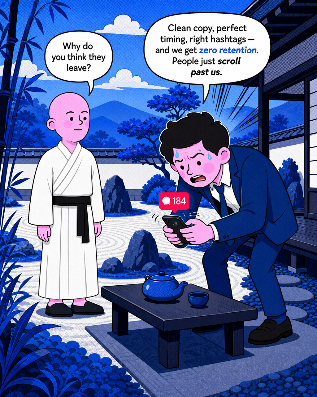
This is where many startup and indie brand content efforts fall apart. The post on Monday looks nothing like the post on Friday. The character from last month's campaign doesn't match the one from this month. Every time the visual drifts, the audience has to re-learn you. They don't. They just scroll.
Brand fluency is what happens when your sixth post looks like it was planned alongside your first. It's the mechanism by which audiences form an emotional shortcut to your brand.
The Duolingo case study is worth sitting with
Duolingo's owl didn't become a subscription driver by accident. The character had built a specific emotional relationship with audiences long before any conversion campaign ran.
By the time Duolingo had established its YouTube presence, the owl was already a cultural fixture. A largely organic TikTok strategy had turned Duo into a meme factory, with stunts placing the character in gyms, weddings, and platform disputes.
Duolingo has publicly reported strong daily active user growth and, by 2025, was generating revenue at a scale exceeding its earlier milestones — with the mascot widely credited internally as a key driver of brand differentiation. The precise causal contribution of the character versus the product itself remains a matter of interpretation.
In early 2025, Duolingo ran a widely covered stunt in which the owl character was faked as deceased. The campaign generated substantial social conversation, though the specific figures cited in various retellings — including exact mention counts and impression totals — vary by source and have not been uniformly verified by independent measurement firms.
That kind of reaction only works if the audience already cares. You can't manufacture that response with a generic mascot. There's nothing to grieve if there's no relationship to begin with.
"Our content is fun, entertaining, it's authentic — those are the facets of our brand that differentiate us," said Duolingo's CMO, adding that posting daily on social was a big "retention driver" for the business by entertaining current customers and attracting new ones.
The owl didn't create that loyalty by being visually consistent. It created it by being characterologically consistent. By showing up the same way every time, with the same energy, the same obsessions, the same specific kind of menace.
Research in brand advertising consistently finds that distinctive brand characters outperform generic creative on recall and attention metrics, though the exact multipliers vary significantly by study, category, and methodology. Industry research firms including System1 and Nielsen have published findings in this area for readers seeking specific benchmarks.
The brief done once is the brief that keeps paying
Here's the practical upshot for any founder or small agency trying to build this without a design team behind them.
A character brief, done properly once, should regenerate across every future campaign without a new illustration order. The character's voice, their personality traits, their visual specs, their recurring problem, their catchphrase — all of it should be locked in well enough that a new post inherits the character automatically rather than starting from scratch.
This is the part that most DIY content workflows get wrong. They create a character once, for one campaign, and then it quietly drifts. A different illustration style next month. A different tone. A slightly different colour. Over six months, the audience has essentially been introduced to six different characters who share a name.
Industry evidence and brand equity research broadly support the view that mascot consistency contributes positively to recognition and emotional connection — though results vary widely depending on execution, category, and consistency of use. A character that looks different every month doesn't compound. It resets.
You need content variety across formats, audiences, and cultural moments. A character ecosystem gives you that range while keeping the brand cues constant, which is exactly what strong distinctive brand assets are supposed to do.
The goal isn't to produce a great single post with a character in it. It's to build something that gets more recognisable with every post you publish.
What a real character brief actually contains
A mascot has a name and a look. A character brief contains:
- A specific personality with named traits (not just "friendly" or "professional")
- A voice with a distinct vocabulary and sentence rhythm
- A catchphrase that captures the character's core tension or world view
- A recurring problem or obsession that drives the narrative in every campaign
- Visual specs locked down to the point of regeneration without drift
- Emotional range: how the character behaves when things go well, and when they don't
That's not a branding exercise. That's the infrastructure your content runs on.
When those elements are in place, a product update post writes itself. The character frames the announcement through their specific lens. The tone is already decided. The visual regenerates from the same spec. The audience recognises it within a second because they've seen this character before.
That recognition, built post by post over months, tends to be more durable than any single viral moment for brands that sustain it. It's how small brands stop looking like they're winging it.
Disclosure: This post is produced by Pitchponies. Pitchponies is designed to lock in your brand characters and regenerate them across future campaigns, with the aim of reducing visual drift and maintaining consistency post after post. See how it works at pitchponies.com.
Send this to a founder who thinks their brand 'just needs a logo.'
Pitch Ponies
Your go-to-market function, from week one.
Your go-to-market function, from week one.
Learn more about Pitch Ponies and get started today.
Visit Pitch Ponies